|
|
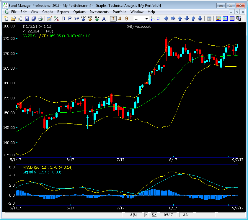
Technical Analysis GraphFund Manager Professional offers powerful technical analysis features. When you choose the Technical Analysis graph type, you will see a graph similar to the one below:
The Technical Analysis graph is divided into an upper and lower section. The example graph shown above is displaying Candlesticks and Bollinger Bands in the upper graph section. The legend is showing that the price on 9/7/17 is $173.21 and it went up $1.12 from the prior day. The ending value on 9/7/17 is $22,864, and the value increased by $148 from the prior day. The Bollinger Bands being displayed are for a 20 period Simple moving average, and with +/- 2 standard deviations. The lower graph is showing the MACD with a long moving average of 26 periods, a short moving average of 12 periods, and a signal line using 9 periods. The vertical blue bars display the difference between the two lines. As with all graphs in Fund Manager, the colors, pens, grid lines, linear/log scale, fonts, etc., are all customizable. You can also pass your mouse over the lines and the values being plotted will be displayed in the optional cursor labels at the graph edges as well as in the status bar. You can customize what data is displayed in each section with the Technical Analysis Graph Options dialog. This dialog is easily accessible by using either the F10 key, or right clicking on the graph, and choosing "Technical Analysis..." from the popup menu, or under "Graphs/Options/Technical Analysis...".
Under the "Share Price Display" your choices are:
For the "Upper Graph Indicator", your choices are:
and for the "Lower Graph Indicator", your choices are:
Each indicator is completely user adjustable. |
| FundManagerSoftware.com | Search | Site Map | About Us | Privacy Policy |
| Copyright ©1993-2026 Beiley Software, Inc. All rights reserved. |

