| The following screen
shots are intended to demonstrate a sample of the
graphing and reporting capabilities of Fund Manager. For
more detailed report screen shots, see the
report screen shots. Fund Manager can display 50 different graph types, and
22 different report types. One of the report types is a "Custom"
report, with over 250 fields available for display. To
read more details on any graph or report type, see the
documentation.
|
| |
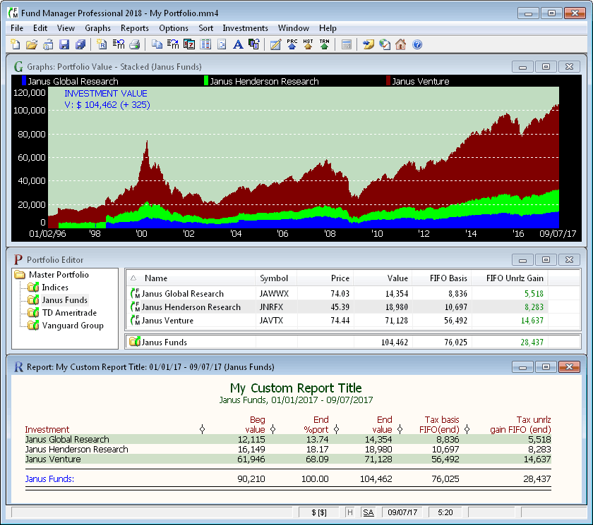 |
| Graph, Portfolio Editor, and a Report Window |
| There are 3 types of top level windows in Fund Manager:
Graphs, Reports, and the Portfolio Editor. You can have as
many open windows as you wish. Each open Graph and Report
window can be set independently to display various data. The Portfolio Editor
window is for managing your sub-portfolios, and their included
investments. This example shows a Graph window
displaying a "Stacked Value - Investment" graph. It also
shows the Portfolio Editor window in the middle. The
bottom window shown an example "Custom" report. Fund
Manager can generate a wide variety of reports. All reports can
be customized for the date range, colors, column widths, header
text, column label text, and
display options desired. Resize report columns by simply
clicking and dragging on the column divider in the report
header. Sort reports by any displayed column using the
"Sort" menu. Reports can be memorized, so you can easily
re-create the same report with all of your desired settings. |
| |
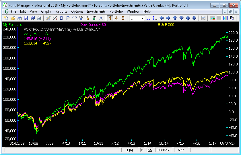 |
| Portfolio/Investment(s) Overlay Graph |
| Use this graph type to compare portfolios against
investments or indices. In the above example the whole portfolio is
being compared against the Dow and S&P 500 indices. The
actual value of the "My Portfolio" is being plotted, and the
equivalents for the indices. The indices are plotted as if
you had invested the same amount at the same times into these
indices, as you did your portfolio. You can overlay
multiple portfolios, and multiple investments. |
| |
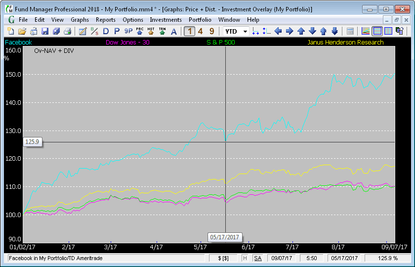 |
| Share Price + Distributions Overlay Graph |
| This graph type can overlay multiple investments on
the same graph. It plots the normalized share
price plus distributions of each investment. The normalizing
value is the price on the beginning date of the
graph. This graph type is also available in the
"share price" type. All colors and fonts are
user-definable. The status bar displays help on the menu
commands, option status, current date, current time, graph date underneath
cursor, and graph value underneath cursor. In this example
the cursor was over the Facebook investment on 5/17/2017.
Different cursor styles are available. The
cursor style displayed here is "Crosshair". This example
also shows "cursor labels", which highlight the current cursor
position. |
| |
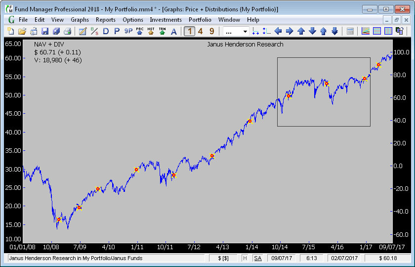 |
| Share Price Summed with Distributions Graph |
| This graph type displays the share price summed with
all distributions. This allows Fund Manager to graphically
display the true performance of investments when
their share price is decreased due to
distributions. The round red circles on the graph
are buy "markers". The yellow X crosses
are distribution markers. The default shape/color
for sell markers is a white triangle. Note,
split, alert, and un-specified lot markers are
also available. Trendlines can also be drawn on graphs. All colors, pen sizes, and marker
sizes are fully customizable. Settings are
memorized on a portfolio basis. The rectangle in
this window is where the user is about to zoom in. By left-clicking and dragging the mouse you can
quickly zoom in on any area of the graph. If the Shift
key is also held down you can zoom in only the
date dimension. If Ctrl is held down the
mouse zoom will only zoom in the value dimension. Quick "un-zoom" commands are available
as key bindings or menu commands. The share
price plus distributions and value
on the ending graph date are displayed in the top
left legend area of the graph. The information displayed
in the legend is user-adjustable. The percentages along
the right side of the graph label the percentage
gain of the share price plus distributions
since the beginning date of the graph.
|
| |
 |
| Value and Cost Overlay Graph |
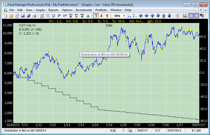
| This graph plots the value and the out of pocket cost
to acquire that value on the same graph. This
allows you to quickly see whether you have gained
or lost money, and how that difference is
changing with time. The plotted "cost" can either be for the
full history of the investment, or only for the currently owned
shares. This example shows the cost for the full history. Yields can be turned on, so
that they are displayed across the top of each
investment. The yield type is specified under the
Options/Yields menu. The 3 month, 6 month, 1 year,
2 year, 3 year, 5 year, 10 year, and yield for
the term of the graph (gph) are all displayed. Whether to
annualize yields, and the length of the yield terms are all adjustable. Yields may also be
viewed in any of the yield reports. This graph
also shows the optional grid lines that can be
turned on or off. Their size and color can also
be specified and saved. This graph displays buy, distribution, and note marker types. The red circle markers indicate purchases. When the
cursor passes over a marker the data for that
marker is displayed in the status bar and popup window. In this
example the cursor was paused over the distribution marker on
5/5/14 (the cursor was not captured in the screen
shot), so the associated data is shown in the
status bar and popup window.
|
| |
 |
| Volume/High/Low Graph |
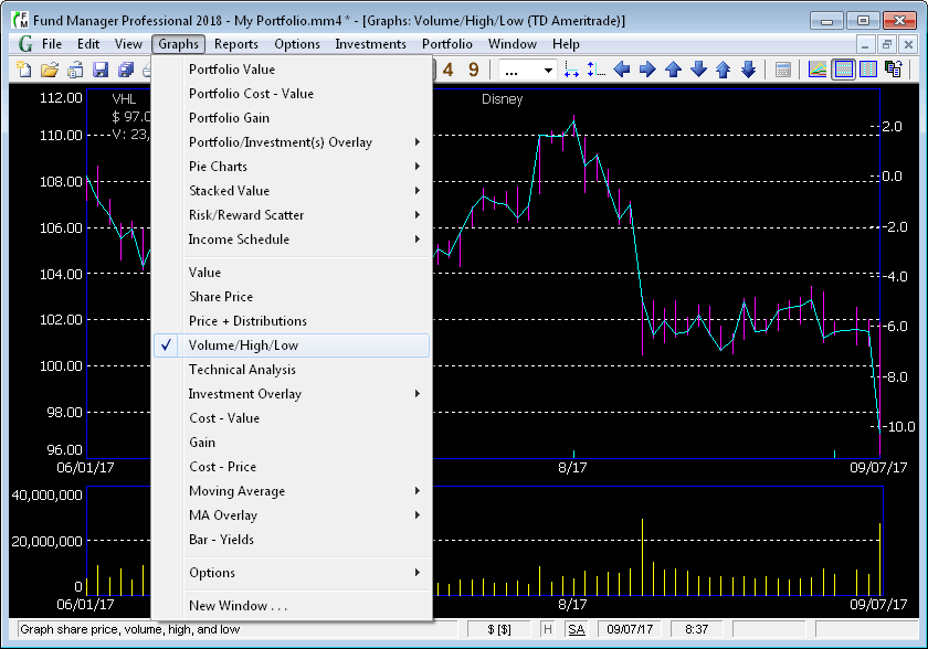
| This screen shot shows the Volume/High/Low graph type.
This graph overlays vertical bars from low to
high on the price line, and along the bottom the
trading volume is graphed. Fund Manager can display the vertical
axis in either log or linear scale. This graph
has only the horizontal grid turned on. The grid
lines can be turned on/off independently. The "Graphs" menu is also
dropped down to show the available choices from
this menu. All graph types above the first separator are
"Portfolio" based, and all those below are "Investment" based.
The graph is being displayed adjusted for splits. This
mode can be toggled on/off, so that the data can also be shown
unadjusted for any splits. |
| |
 |
| Moving Average Overlay Graph |
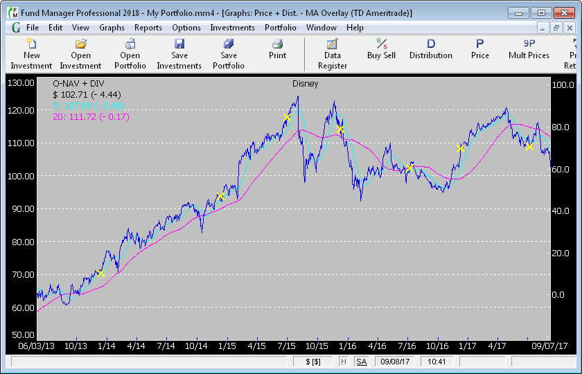
| This graph type overlays the share price plus
distributions with the moving averages of the
same. Up to 6 moving averages can be overlaid for
any desired number of weeks. There is also an
equivalent overlay graph to overlay the moving
average with the share price. The values shown in
the legend are for the ending graph date. On 9/7/17 Disney had a closing price plus distributions of $
102.71 (down 4.44 from 9/6/17), its 5 week
moving average was $ 107.89 (down 0.48 from 9/6/17),
and the 20 week moving average was $ 111.72 (down 0.17 from
9/6/17). The toolbar is shown here
with the option to display labels turned on. Which toolbar buttons are displayed and their
appearance can be customized.
|
| |
 |
| Out of Pocket Share Cost and Share Price Overlay Graph |
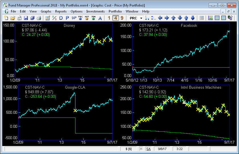
| This graph overlays the share price (also called Net Asset
Value) with the out of pocket cost for each share. The out
of pocket cost is calculated by adding all purchases,
subtracting all redemptions, and subtracting all received
distributions. This sum is then divided by the total
number of shares owned to obtain the out of pocket cost for each
share. The purchases only include out of pocket purchases,
not reinvested distributions. Likewise, the received
distributions only include distributions paid to you in cash,
not reinvested distributions. This cost is not the same as
the tax basis cost, but is intended to show the break even point
on your investment. This graph lets you quickly see at any
point in time where your break even point is, and how much
above/below the current price you are situated. You can
plot either the historical cost, or the cost of only your
currently owned shares. The legend on this graph type
displays the ending date's share price and out of pocket cost.
The legends can be customized to display any desired data. |
| |
 |
| Technical Analysis Graph |
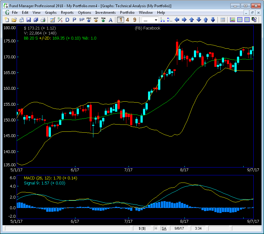
| This graph is an investment based graph that provides a
variety of technical analysis indicators. The technical
analysis graph is available in the Professional and Advisor
versions of Fund Manager. [more info] |
| |
 |
| Pie Chart Graph |
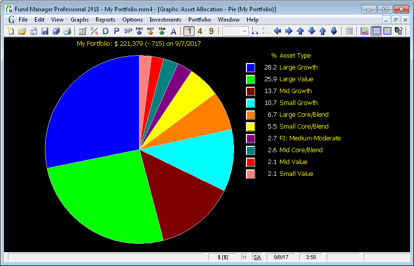
| This graph shows a sample pie chart, where each pie segment
represents the amount owned in each asset type. The pie
chart graph can be displayed with segments for each investment,
symbol, asset type, investment goal, sector, investment type,
sub-portfolio, currency, or tax status. The labels for your asset
types and investment goals can be customized, so you can use
these for a wide variety of tracking. Each investment can
be assigned in percentages to any number of asset types or
investment goal categories. Left mouse click on any pie
slice to create a quick-zoom report showing the details of that
pie slice. |
| |
 |
| Risk/Reward Scatter Plots |
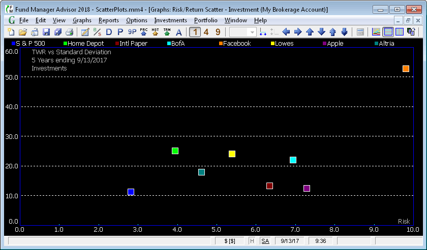
| This graph is a scatter plot showing the return earned
versus the risk taken for a variety of investments, plus the S&P
500 index. Risk/Reward scatter plots are available for
investments, asset types, investment goals, symbols, investment
types, or sub-portfolios. The risk/reward scatter plots
are available in the Professional and Advisor
versions of Fund Manager. [more info] |
| |
 |
| Income Schedule Graphs |
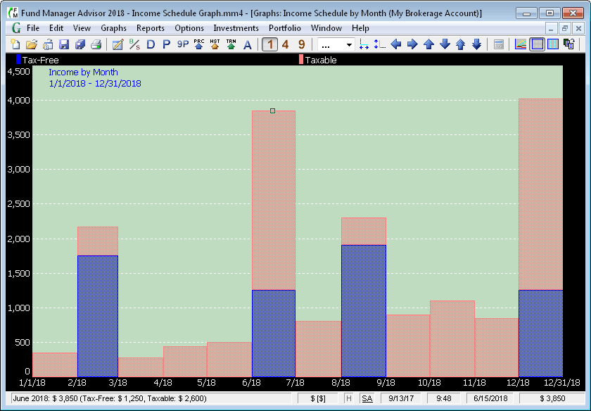
| This graph is a bar chart of expected future income versus
time. These graphs can plot income by month, quarter, or
year. Optionally show a break down by tax status (tax-free
versus taxable) or income style (dividend versus bond interest). [more info] |
| |
 |
| Seasonality Graph |
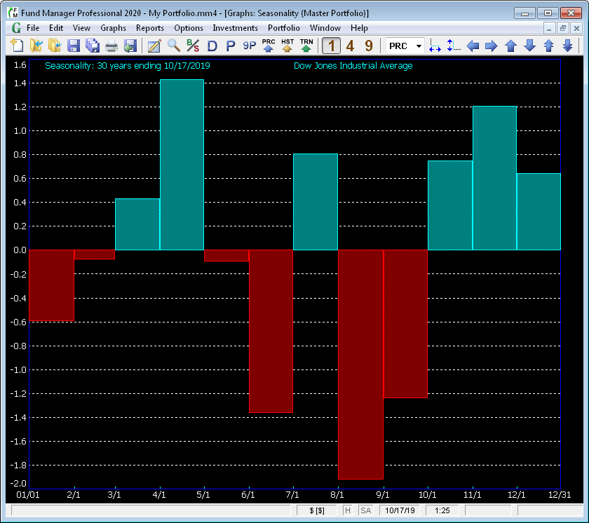
| This graph is available as both an investment based and portfolio based graph that displays relative performance during different parts of the year.
The seasonality graph is available in the Professional and Advisor
versions of Fund Manager. [more info] |
| |
 |
| Data Register and Buy/Sell Dialog |
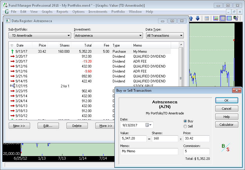
| The Data Register allows
the viewing/editing/entering/deleting of any type
of transaction or price data. The "Data Type"
combo box selects whether to edit Prices/Transactions/Notes/Alerts,
or subsets of each main data type. The Data Register displays data for the selected
investment from the "Investment"
combination box. This example shows selecting one
transaction, and the Buy or Sell Transaction
dialog box displayed when the "Edit"
button is selected. By selecting "New"
instead, a new transaction could be recorded. The
data displayed in the Data Register
can be sorted by clicking on a particular column
header. The column widths are resizable, and the
order of the columns can be adjustable by
dragging a column with your mouse. The number of
significant digits displayed in reports, graphs,
and dialog boxes is adjustable. For more, see the
Data Register Tutorial. Fund Manager has many more
features than shown here. For more screen shots, focusing on the
reporting capabilities, see the
report screen shots. You can also download a copy to try out for
free, and evaluate the program for yourself. Once
you've downloaded and installed Fund Manager take
a few minutes to walk through the online tutorials.
|